Real Estate Brand Identities
Distinct identities built for distinct places.
AFS Creative Studio · Studio engagement
AFS Creative Studio Client · In collaboration with Catalyst Marketing
Brand Identity · Real Estate
AFS Creative partners with Catalyst Marketing to develop distinctive brand identities for multifamily residential developments. Each identity translates the property’s positioning, audience, and sense of place into a cohesive visual system designed to extend across digital, print, signage, and property marketing.
The Park at South Stadium
Real Estate
Brand Identity
AFS Creative Studio Client
The Challenge
A residential property identity has to establish a specific sense of place while remaining practical across the many applications required for leasing and property marketing.
For The Park at South Stadium, the identity needed to communicate ambition and community as one connected idea, with enough flexibility to work across large-scale awareness, digital content, and everyday brand materials.
The Approach
Working with Catalyst Marketing, AFS Creative developed an identity system that uses a structured logo, high-contrast typography, and a confident palette of blue, orange, red, and cream.
The system balances editorial polish with an energetic, urban character. Modular color fields, concise messaging, and lifestyle imagery allow individual applications to feel varied while remaining part of the same property brand.
The Park at South Stadium
A multifamily identity built around the idea that ambition and community can share the same address.
A flexible mark with an editorial edge.
The logo system pairs bold geometric fields with an elegant wordmark, creating contrast that can scale from compact marks to wide-format applications.
A distinct sense of place.
A bold palette and candid lifestyle direction give the property a lively, recognizable presence without losing the structure needed for day-to-day marketing.
Designed for property marketing in the real world.
The system carries through social, print, merchandise, and awareness creative with a consistent voice and modular visual structure.
A brand identity built for the property.
The result is a complete brand identity for The Park at South Stadium: a distinct sense of place, delivered as a focused system that remains usable across the practical demands of residential property marketing.
All the work, every example.
8 images
Folly Nutrition
View case study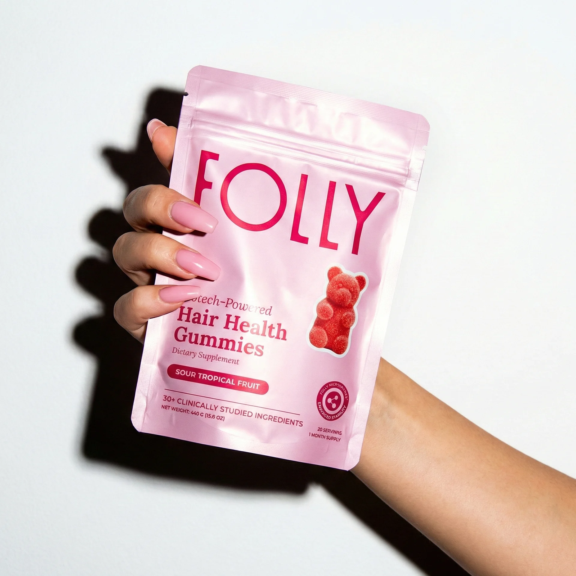
Need a creative partner?
AFS Creative partners with growing brands on identity, websites, campaigns, and ongoing creative.